Hirogin Group
Visualizing the personalities of the Hirogin Group from the purpose
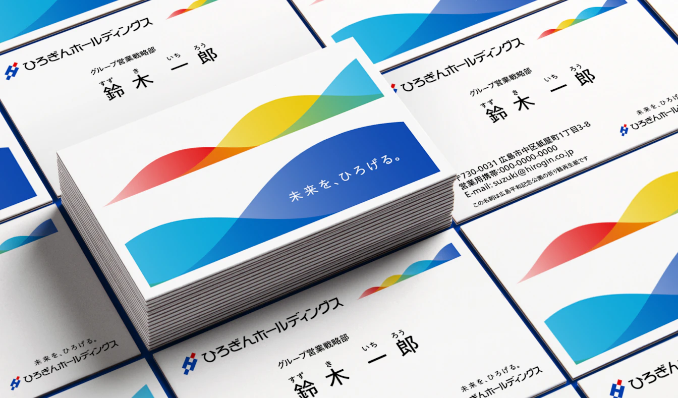
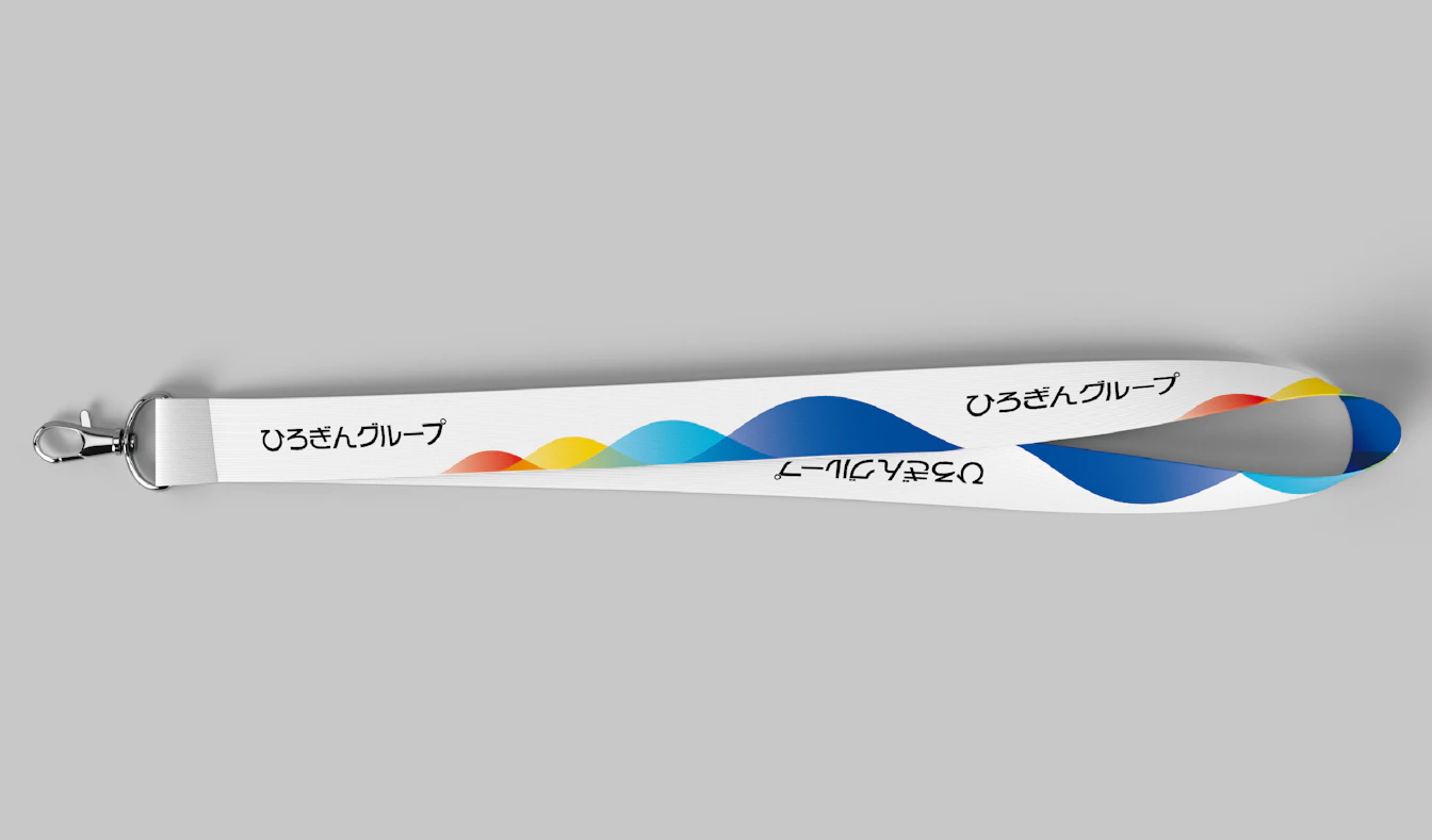
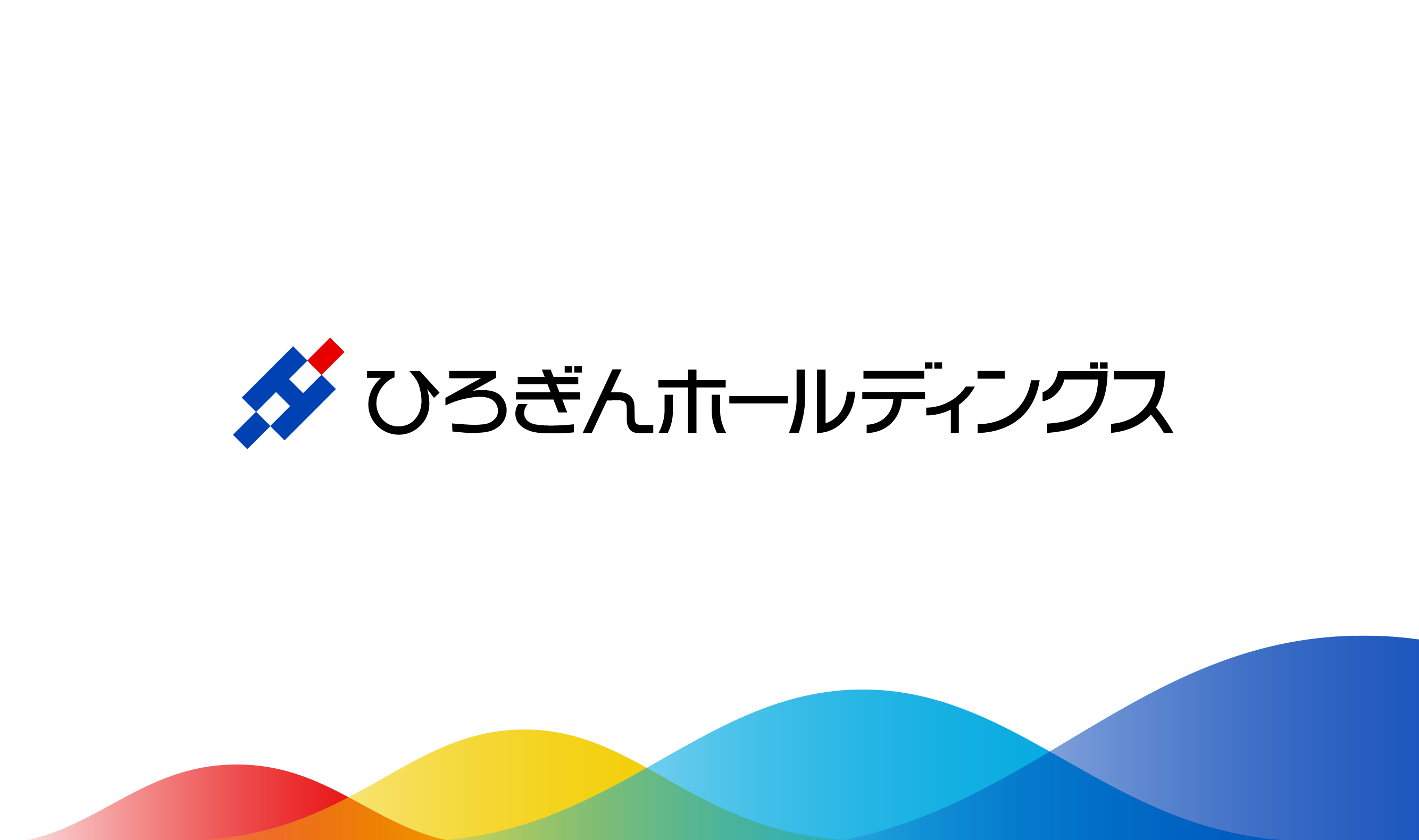
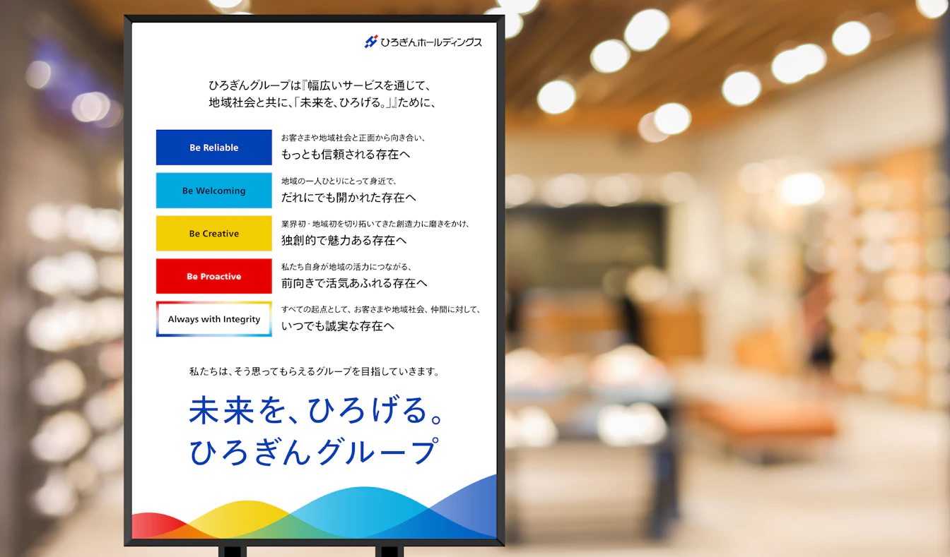
A branding project for the Hirogin Group, with Hiroshima Bank at its core. In 2024 the Hirogin Group has formulated a brand strategy based on the Purpose: “Expanding the horizons of the future alongside the regional community through wide-ranging services." First, the Hirogin Group has established a personality that clearly defines what it aims to achieve in its purpose. They then established a brand design that visually expresses the image and worldview they want their stakeholders to perceive, and began rolling it out in October of the same year. The personalities have been chosen to carry on the trust and integrity that has been cultivated over the years, but with the determination to become a more approachable presence as a comprehensive regional service group. The brand design is based on the blue and red colors of the Hirogin logo, with the addition of light blue and yellow to create a four-color wave that overlaps and spreads out, expressing the spreading out of the future and depicting the new personality of the Hirogin Group.
| Client | Hirogin Holdings, Inc. |
|---|---|
| Industry | Finance / Consulting / IT / Education, etc. |
| Category | Group Branding |
| Service | Brand Strategy/Brand Architecture / Brand Concept/Purpose/Corporate Philosophy / Brand Style / Item Design / Brand Guidelines |
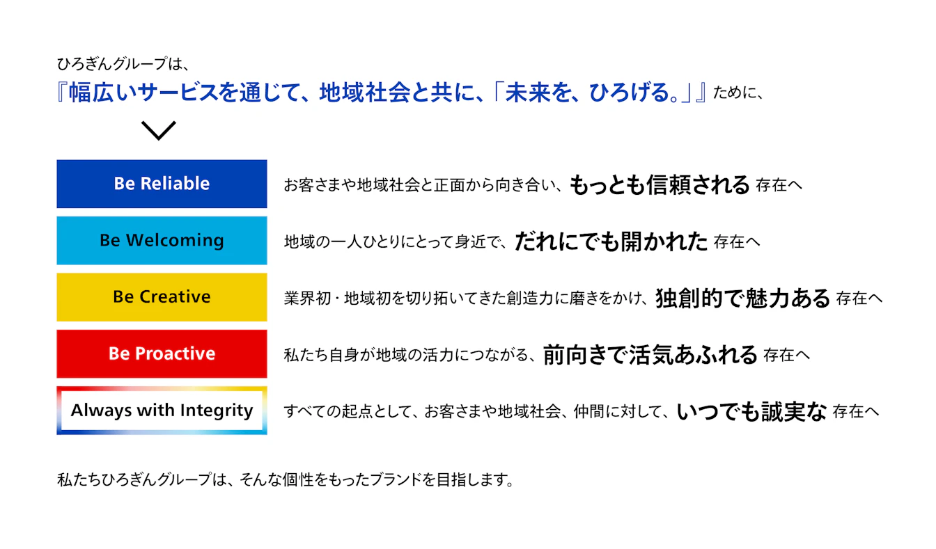
Personality
Personality defines how the Hirogin Group wants to be viewed by its stakeholders.
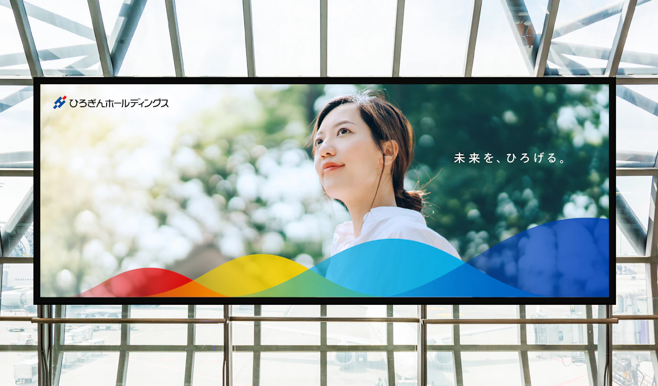
Image board
The image board is a symbolic visualization of the brand's worldview.
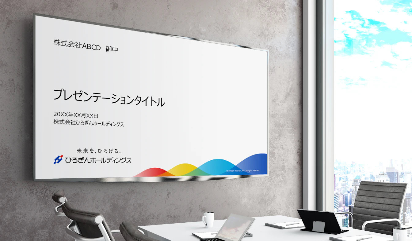
Poster design is not our output, direction only.