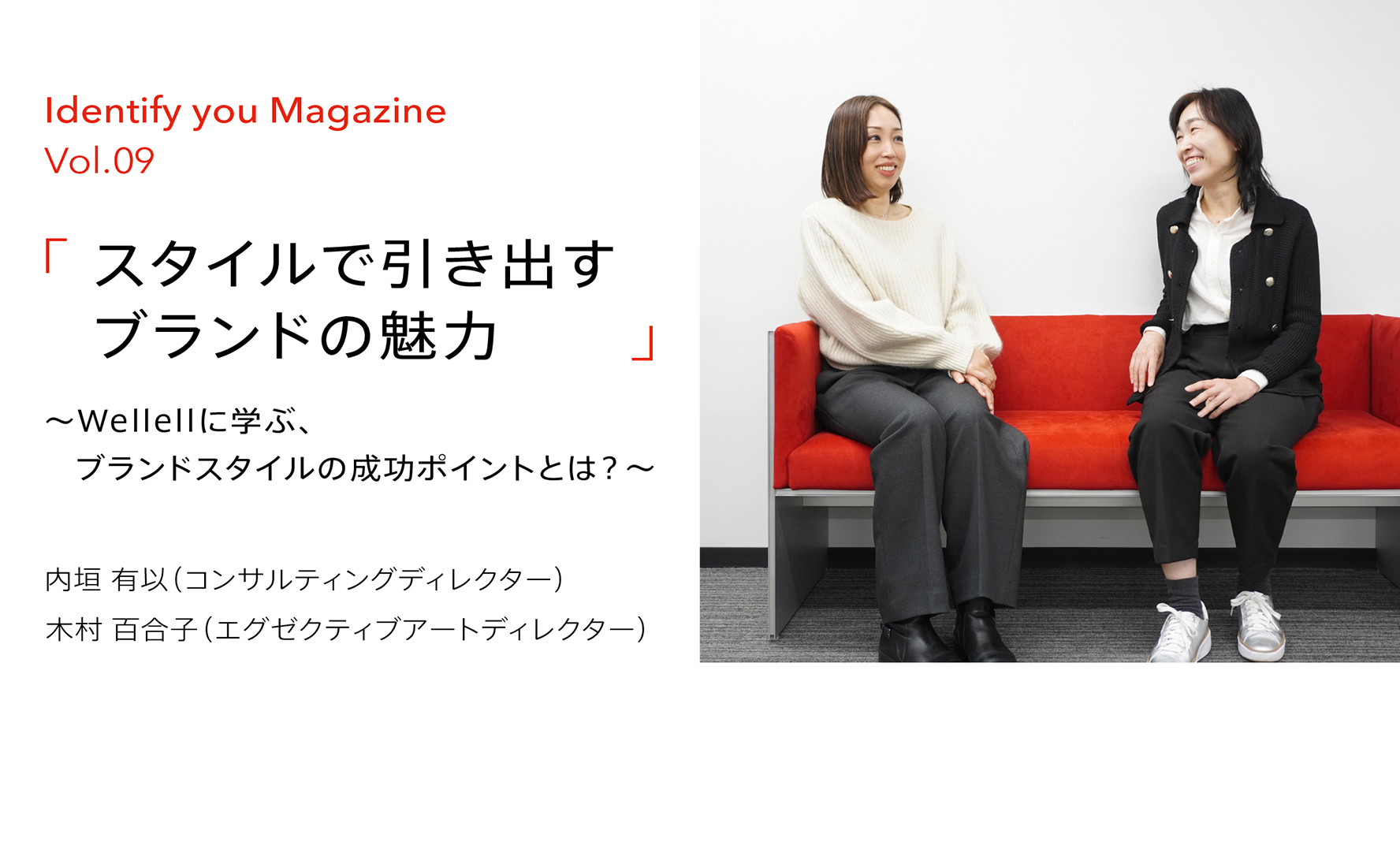
Yui Uchigaki
Consluting Director
2018
Joined Gramco
The theme of this issue is “brand style”.Each brand has its own unique personality and characteristics. How can we convey this in an attractive and intuitive impression? In this column, we will introduce the importance of brand style and its techniques.
Identify you Magazine Vol.09
When people are exposed to a brand, they intuitively decide whether they like or dislike it based on their previous experiences. This is why it is extremely important in brand building to convey the brand’s character in an appealing way, as an intuitive impression rather than a logical one. This column explores how brand style affects corporate branding through the rebranding project for Wellell, a Taiwanese medical device manufacturer. Here we show how Wellell’s brand style has increased employee engagement and driven the company’s future. We also discuss the secret to a successful brand style and the importance of top management’s involvement.
-- So what exactly is “brand style,” the topic of this session? First of all, could you both tell us what you think?
Uchigaki
Since the brand concept is the foundation of all brand activities, I think it’s all about how to visually express the brand in a consistent manner based on the concept. Specifically, the brand style is incorporated into design elements such as color, photos, layout, and graphic elements and created so that the “uniqueness” of the brand, which is commonly felt in all of these elements, can be managed.
Kimura
Additionally, in creating a consistent style, it is necessary to first convert the brand concept into creative keywords, instead of connecting it directly to design elements all at once. A common awareness is raised for those involved in the brand by replacing the original concept with creative words that are more easily developed into photos and colors in a way that is consistent with the brand worldview conveyed in the original concept. The key is in the extent to which you can jump-start this conversion to creative words and how far you can replace the concept with clear expressions while still remaining creative.
Uchigaki
For example, if we are aiming for a “progressive” brand image, the nuances of such an image will differ depending on the company. Through considering what kind of brand it is, whether it is more humanistically or technologically progressive, the expression unique to the company will become clear.
Kimura
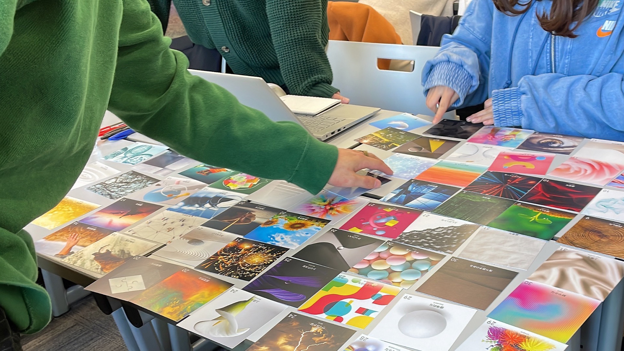
To this end, we have recently had our clients work together with us in sessions to derive keywords. From a selection of more than 50 cards with pictures and colors, the participants select a card that is unique to the brand and verbalize why they chose that card. The point is to choose non-verbal indicators first. Repeated verbalization based on the senses can evoke the essential character of the brand.
--Thank you very much. In addition, we would like to hear more about the actual cases the two of you have worked on. Can you tell us about Wellell, the Taiwanese medical device manufacturer?
Uchigaki
Wellell is a project we supported for about two-and-a-half years, starting in April 2019. There were three issues that needed to be resolved in our branding initiative. One was the issue of the company name. Originally founded as a medical equipment trader, the company was named APEX Medical. As “apex” is a commonly used word that means “summit,” several other companies have the same name in the medical industry, so the difficulty of differentiating the company by name was an obstacle to global expansion. Second was the matter of the company’s identity. As the company shifted from a trading company to OEM/ODM and then to developing its own brand, it lost sight of its purpose, that is, why it was involved in this business in the first place. This had to be properly redefined. Third, when it became necessary to shift from being a B-to-B business to a more B-to-C business, the issue arose that customers may not understand the current messaging.
To resolve these three issues, as the project progressed, we defined a new concept for the brand, developed a logo in accordance with this concept, and expanded it to building a brand worldview or style. As a result, I think the brand has been reborn as one that is also easy for B-to-C customers to understand.
Kimura
Whether to change the company name or develop a new logo had not been decided at the start of the project. However, as we discussed what the company would want to be in the future, we began to see issues with the essence of the company name and logo and decided to take the plunge and change them. The fact that the project was based on a concept and went in a direction that firmly expressed this in a future-oriented manner was a major factor in the project’s success.
--What were some of the challenges in developing the brand style? I’m told that everything was done remotely because of the pandemic.
Kimura
Kimura Conducting creative sessions remotely was not much of an obstacle. They were enthusiastic in their selection of photos. However, there was some confusion at the beginning in terms of being at cross-purposes about how to use the photos. In APEX’s past worldview, photos focused on scenes of people using its products. With the change to Wellell, we set two new creative keywords, Vital and Refresh, and selected photos appropriate for them.
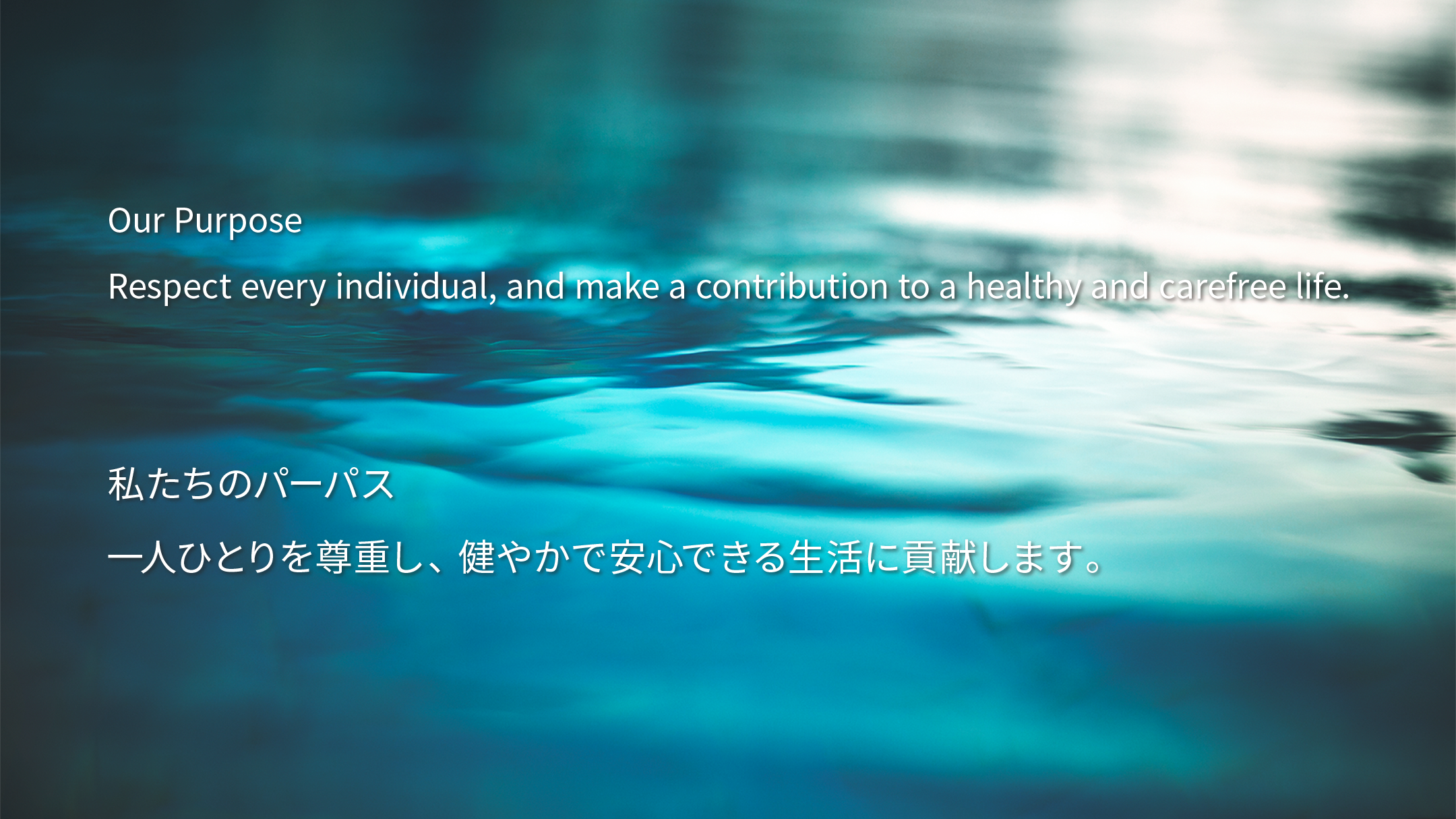
To express the “Carefree life” set forth in the Purpose, we proposed photos of clear water and clean air that convey the image of products that allow people to breathe comfortably. At first, however, they did not seem to be very comfortable with this metaphor.
A company or brand’s purpose statement expresses how it provides value to society and how it realizes its raison d’être. It goes beyond mere product functionality to express a philosophy that contributes to society and everyday lives. The “Carefree life” as a purpose is another example of the company’s mission to support its clients in living a life of comfort and freedom.
After several explanations, they understood our intentions, and in the end, I feel that we were able to share a worldview that embodied the phrase “Carefree life” set forth in the Purpose.

Uchigaki
Once you have decided on a style, you must be thorough. At Wellell, the style is not only reflected on the website but also, of course, in the showroom at the headquarters. They also seem to be sticking to the same color on social media; their awareness of thoroughness in branding may be higher than that of Japanese clients. The newly decided turquoise blue color is called Wellell Blue. They like it so much that it has become a major identity for them and is used in various places, such as the walls of their offices.
Kimura
I understand that some of their employees wanted novelty goods made for customers, such as water bottles and shopping bags, and they began to sell them to their employees at cost. It is wonderful to see the power of design enhancing employee engagement.
Uchigaki
They distribute original T-shirts to employees and have a uniform day once a week. Younger employees, particularly, have received the revamped brand design well. From a marketing perspective, some employees also say that they have repositioned themselves in line with the brand concept, that their awareness of sales methods has changed, and that they are now able to take on more challenges than before in terms of R&D. There seems to be a change taking place that was not present at APEX.
-- It seems that branding that creates positive change will become increasingly necessary in the future. Could we have a few final words from each of you?
Uchigaki
If a company can properly express its identity, it can trigger interest; people who empathize with that identity, who we might even call fans, may become future customers and contribute to the company’s business. Brand style is the creation of opportunities for people to get to know a company and for the company to communicate what it is, so I hope people will understand the potential in this area.
Kimura
When it comes to style building, the involvement of top management inevitably tends to be lower than when changing the company name or logo, but the intent of top management is very important because it can significantly change the impression of the brand. Employees in the field have the chance to make a big difference through orientation toward the future in a place normally inclined toward the status quo.
We promise that shifting from a place where creativity takes place only with logos and logo manuals to a direction where it is supported with a style and guidelines will make the brand more unique. We encourage you to put it into practice with us!
Wellell
Established in 1990 as a medical equipment trading company under the name APEX Medical Corporation. Later, it became a self-manufacturing ODM/OEM company. In the last decade, the company has expanded its business to about 60 countries around the world with its own products under the APEX brand name. Furthermore, the founder and current chairman, Daniel Lee, has decided to establish a greater presence and solid position in the global market by developing a business strategy that not only innovates products using digital technology but also provides related services. The rebranding process began in April 2019. In January 2022, the company evolved into the new Wellell brand and changed its name to Wellell Inc.

Consluting Director
2018
Joined Gramco

Exective Artdirector
2003
Joined Gramco
Identify you Magazine Vol.08
2024.02.07
Identify you Magazine Vol.07
2024.01.24
Identify you Magazine Vol.06
2023.02.17