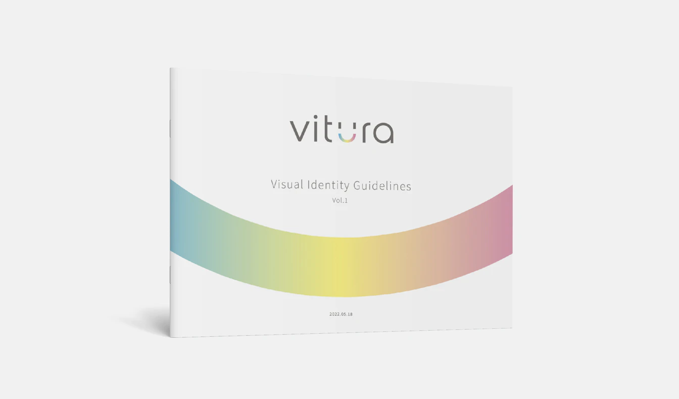
Vitura
A new project to launch a B2C brand
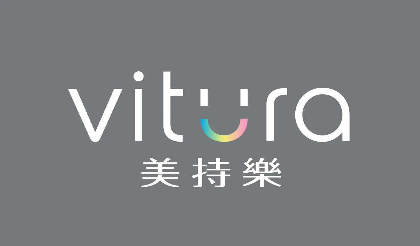
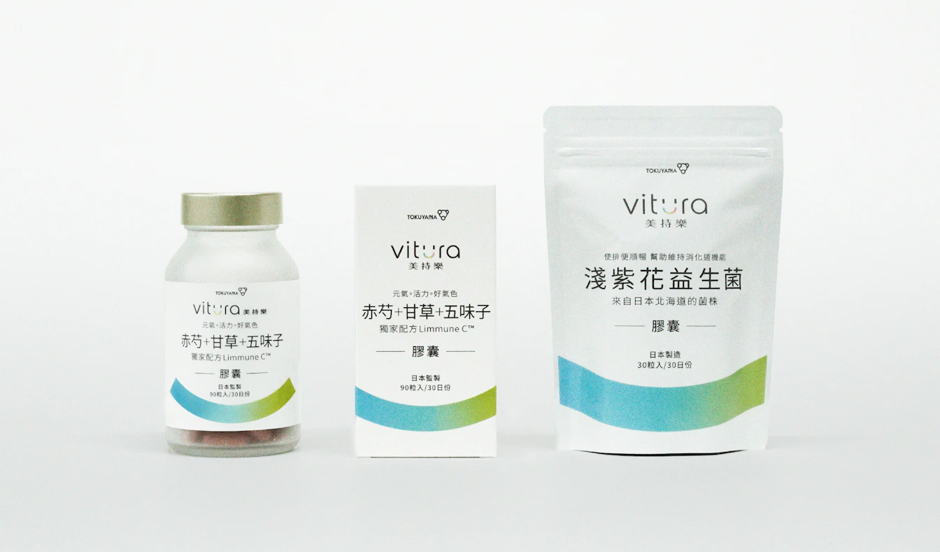
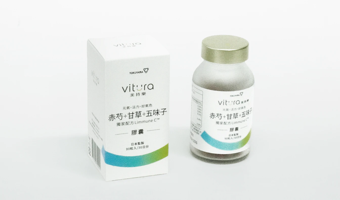
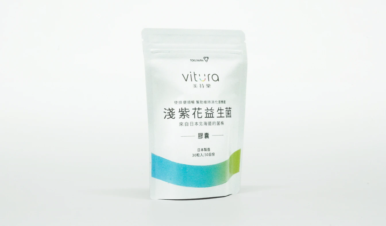
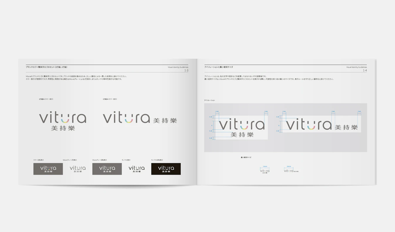
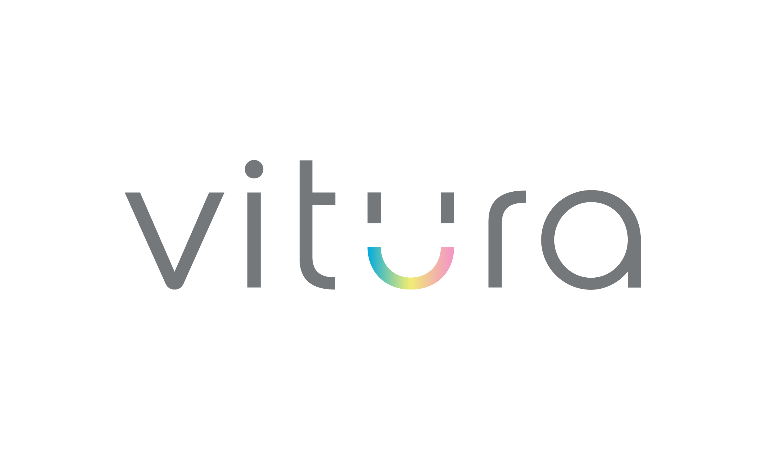
This is a new business brand development project that we undertook with (what was then) the Taiwan Research Institute of Tokuyama Corporation. The company decided to launch a health food business, with "health" being a priority area in its mid-term management plan. We helped the company build a B2C brand, which was a new endeavor for the company. Through sessions with the head of the Tokuyama Taiwan Research Institute and the team in charge, we formulated a brand concept and developed the name "Vitura" (coined from Vivid + Natural) to symbolize the brand. In the VI, we aimed to combine smart thinking from experts in life sciences with the approachability and friendliness of a company that offers products and related services using natural ingredients. The packaging is designed with muted colors to present a clean and dignified impression. The "smile line," which represents the curve of the letter "u" in Vitura as a smile, was designed to be used as a graphic element of the brand across all media, giving it personality and making it easy to remember for the average consumer. In the future, when the number of product categories increases, the "smile line" can be changed with different colors to provide business differentiation.
| Client | Tokuyama Corporation |
|---|---|
| Industry | Chemistry / Electronics / Life Sciences, etc. |
| Category | Business Branding |
| Service | Brand Concept/Purpose/Corporate Philosophy / Naming / VI(Visual Identity/Logo) / Item Design / Brand Guidelines |
| Partner | Wellell |