@blue
Parking reimagined through space management
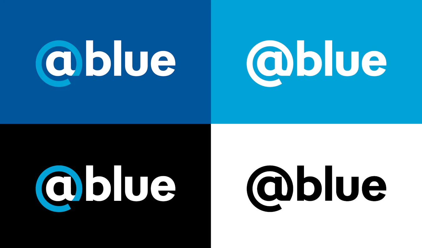
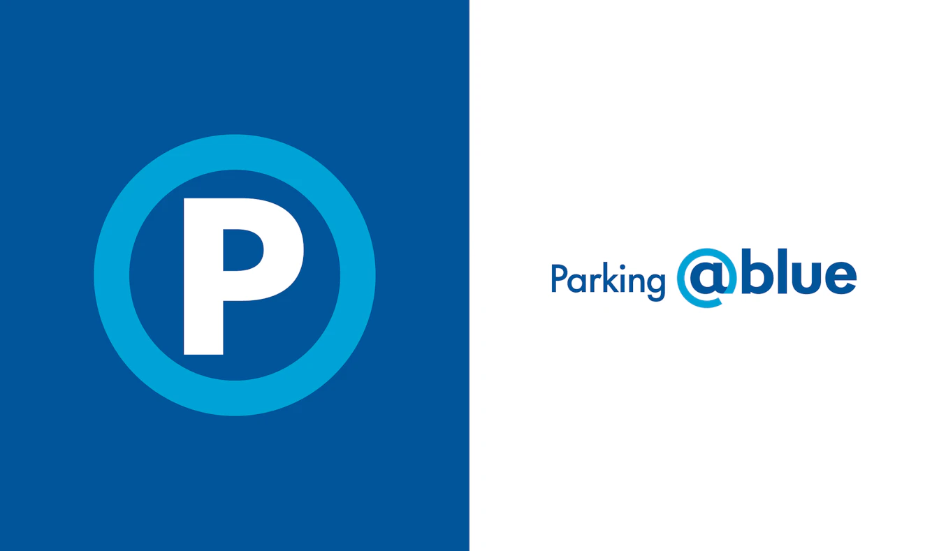
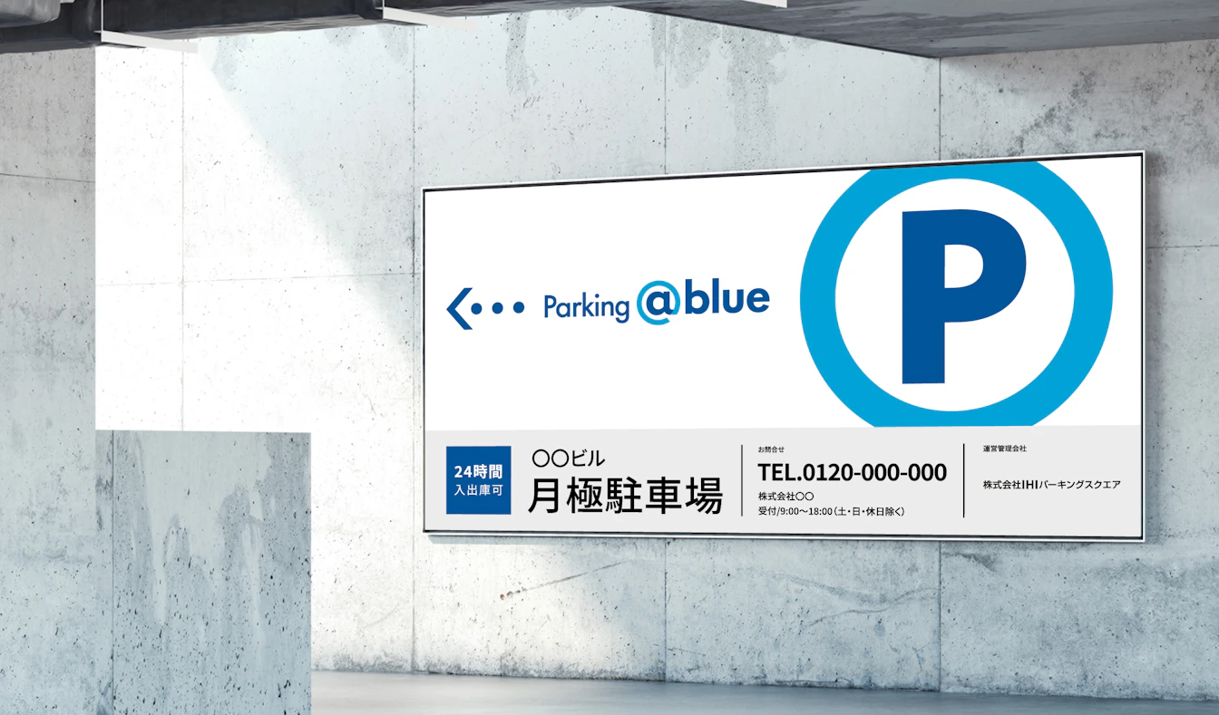
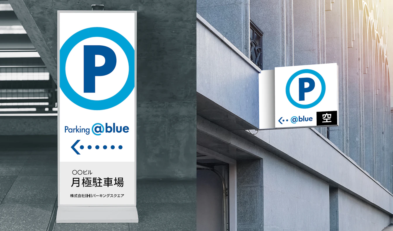
This brand development project for the parking system business redefines the traditional scope of “parking lot operations” by introducing the innovative concept of “space management,” a vision for maximizing the potential of space. Building on this concept, we created a new brand name and visual identity. The brand name “@blue” reflects the aspiration to create a place where both people and vehicles can relax, refresh, and feel a sense of clarity and comfort. The circular “@” symbol in the logo represents how @blue connects people, mobility, and society, generating new flows and encounters within urban spaces. The color palette blends IHI Blue with a brighter blue tone, expressing a balance of trustworthiness and forward‑thinking innovation.
| Client | IHI Transport Machinery Co., Ltd. |
|---|---|
| Industry | Parking system |
| Category | Business Branding |
| Service | Naming / VI(Visual Identity/Logo) |