The Capitol Hotel Tokyu
Inheritance and Evolution: Connecting Japanese Hospitality to the Next Generation
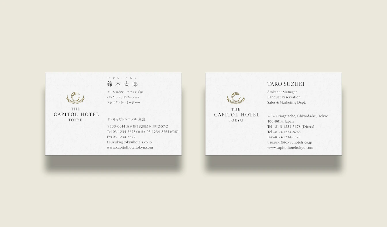
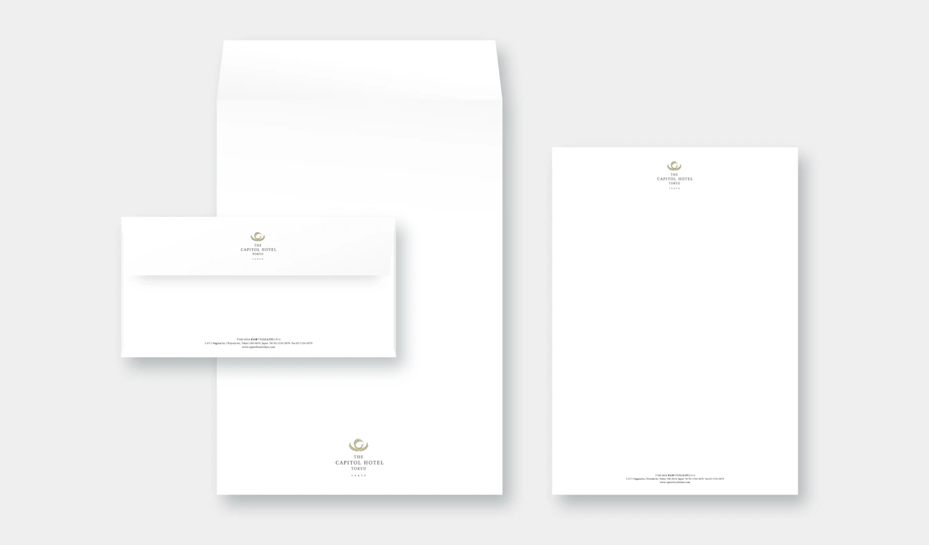
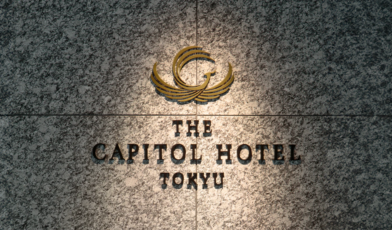
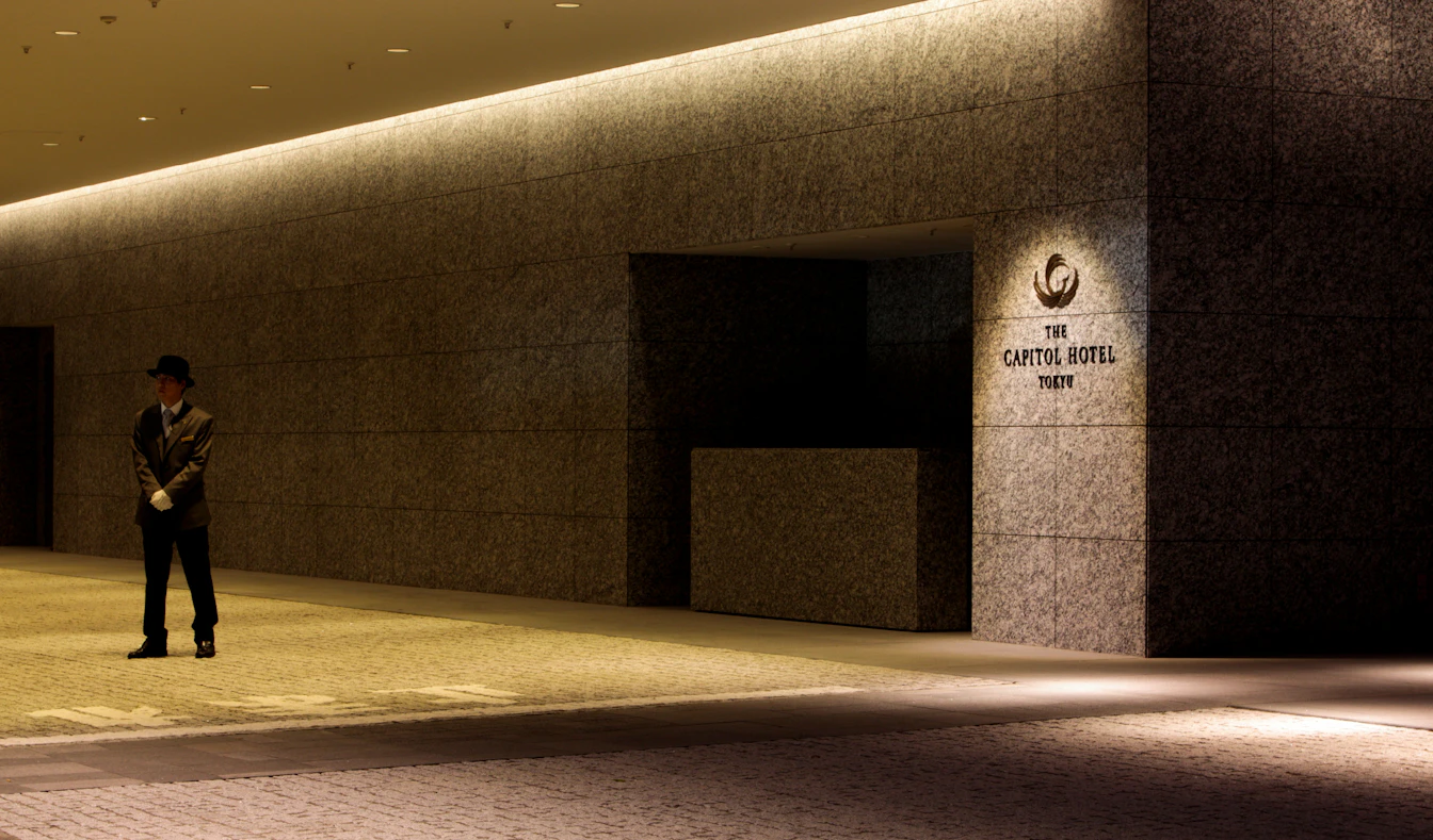
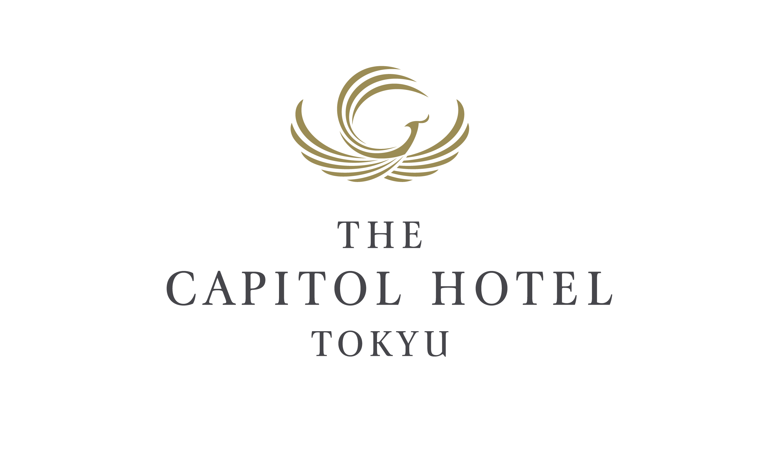
The former Capitol Tokyu Hotel was closed down for reconstruction in 2006. A branding project was initiated in the lead up to its reopening in 2010. The development of a highly unique brand identity was required given the opening of several foreign-affiliated hotels in the area. The logo used is a "phoenix," to symbolize continuous regeneration and evolution. The phoenix is a sacred bird symbolizing peace and harmony, thus symbolizing the hotel's brand vision of "transient yet eternal," and also reflects its commitment to heartfelt relaxation. The brand concept and brand symbols created through this 3-year project are still used today, and the hotel has received the highest five star ratings in the Hotel Category rating published by the world-authoritative Forbes Travel Guide for four consecutive years since 2021.
| Client | TOKYU HOTELS & RESORTS CO., LTD. |
|---|---|
| Industry | Hotels / Restaurants / Resort management |
| Category | Business Branding |
| Service | Brand Concept/Purpose/Corporate Philosophy / VI(Visual Identity/Logo) / Brand Style / Item Design / Brand Guidelines |