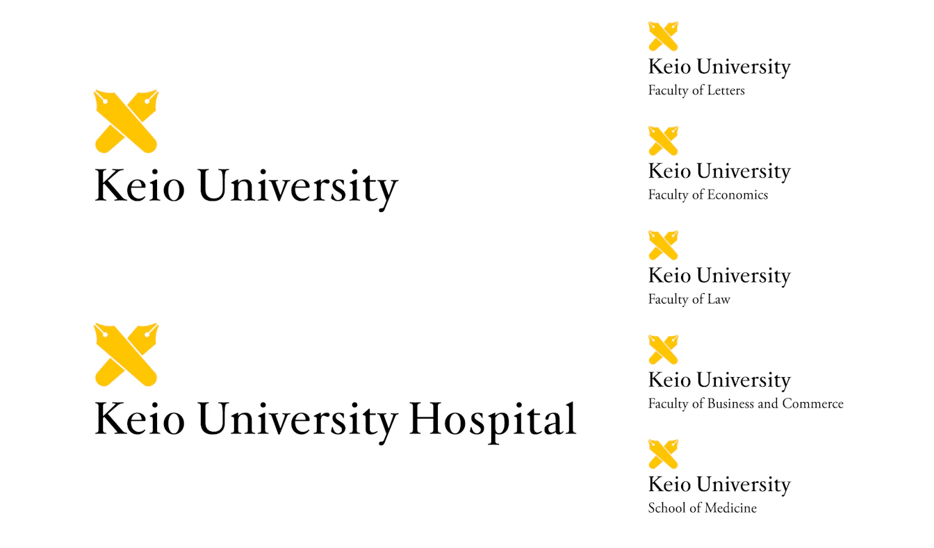
Keio University
A visual identity that incorporates the idea of being a "Leader of Society"
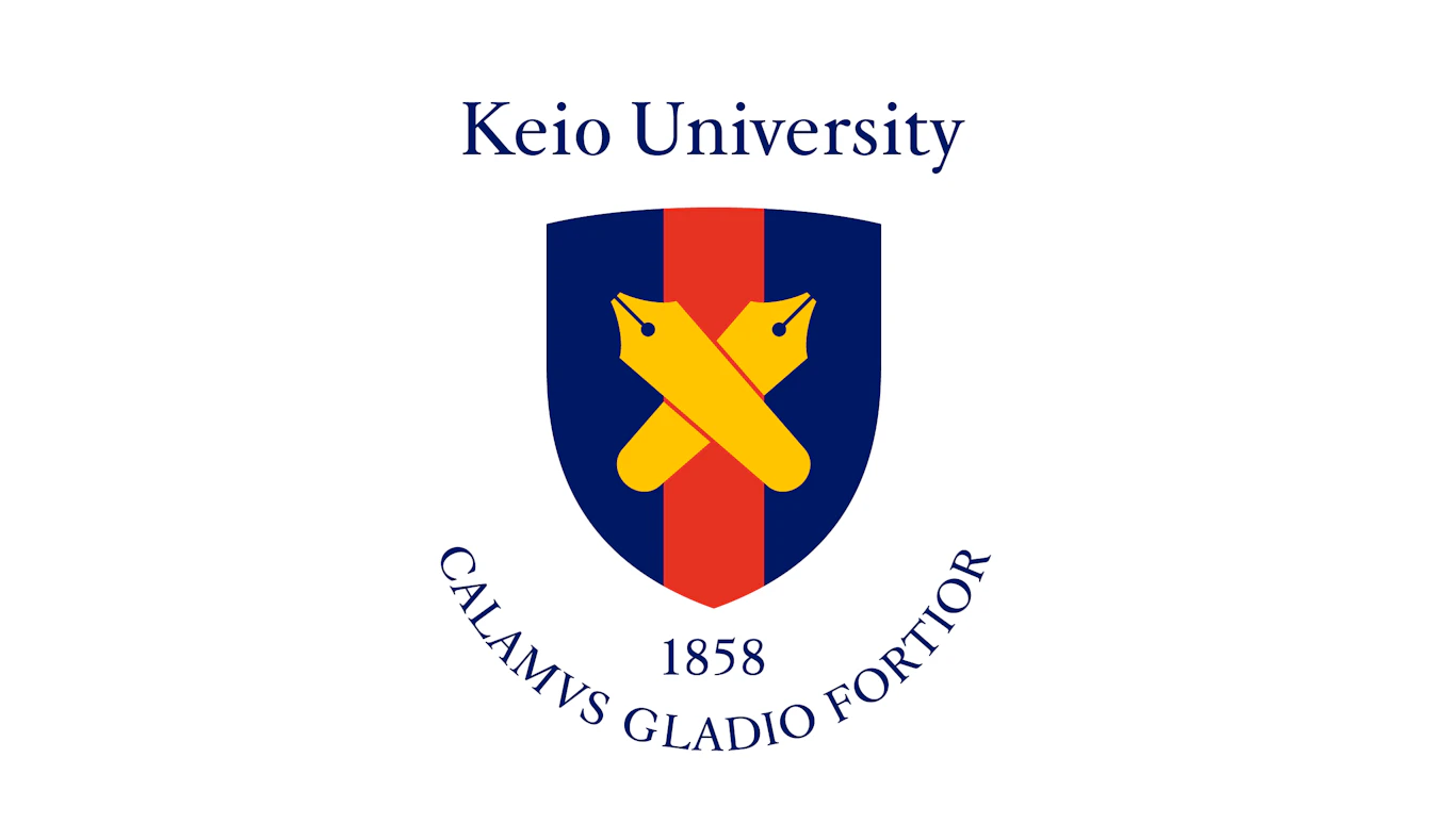
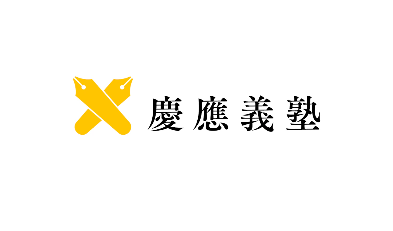
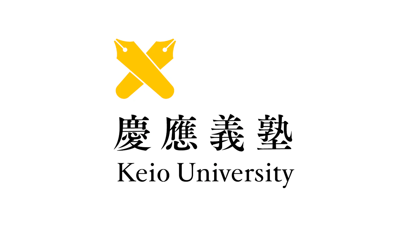
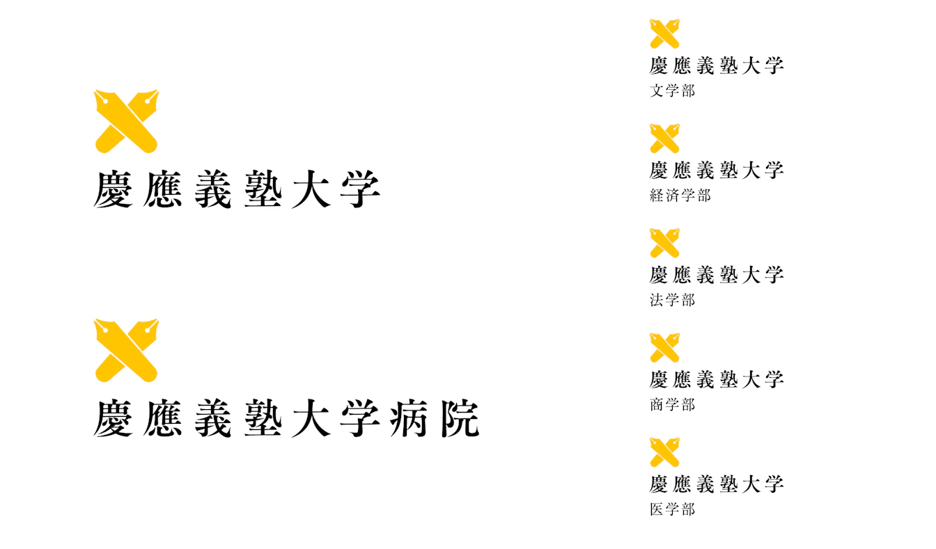
This branding project was implemented to commemorate the 150th anniversary of the university's founding. Gramco assisted from the concept development stage to redesign the university's symbol depicting a pen, its emblem, and three color flag, as well as color specifications and their application to various items. The concept and slogan were inspired by the words of the university's founder, a renowned Japanese thinker Yukichi Fukuzawa, in his speech to alumni of the school, in which he referenced "leaders of the society." The famous "pen is mightier than the sword" pen logo has had many design variations and we have unified them into a single design with a wider nib and narrower base to create a form that gives a sense of ascent and to better fit the concept of being a "leader of the society." The colors of the blue, red, and blue (BRB) flag also varied; thus, we redefined and standardized the colors. This logo was used throughout the university on the occasion of the 150th anniversary celebration. In 2015, we also developed an original logotype that reflects the uniqueness of Keio University, further improving its visual identity.

| Client | Keio University |
|---|---|
| Industry | Education |
| Category | University Branding |
| Service | Brand Concept/Purpose/Corporate Philosophy / VI(Visual Identity/Logo) / Item Design / Brand Guidelines |