Sembikiya-Sohonten
Continuously evolution for ongoing sustainability
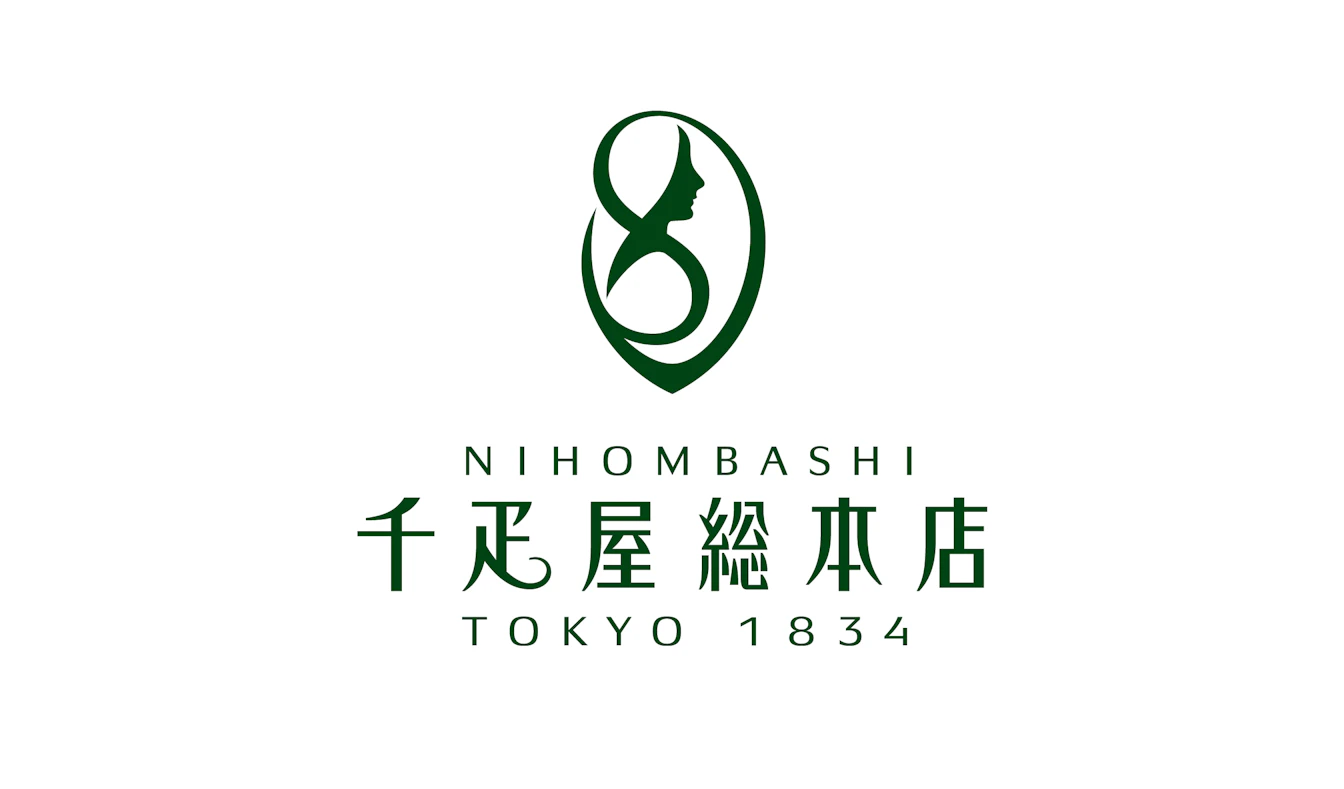
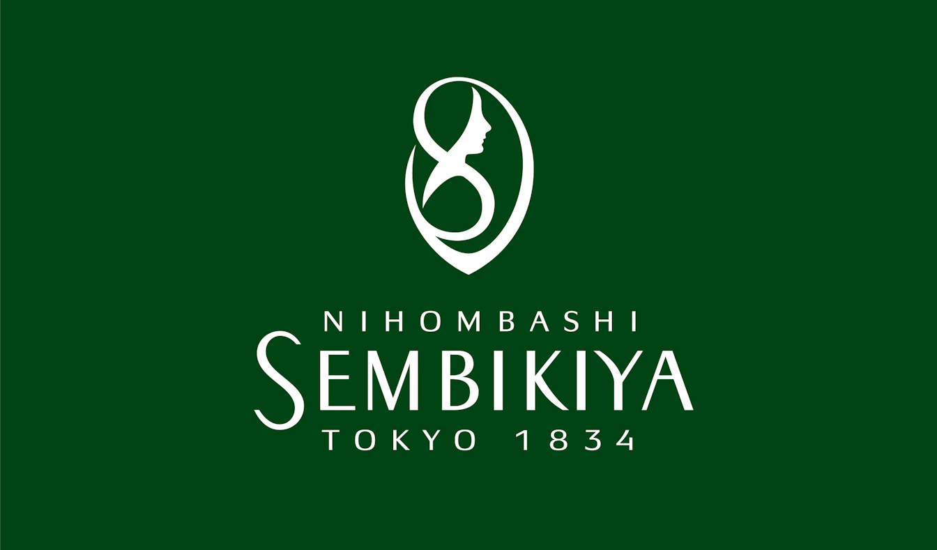
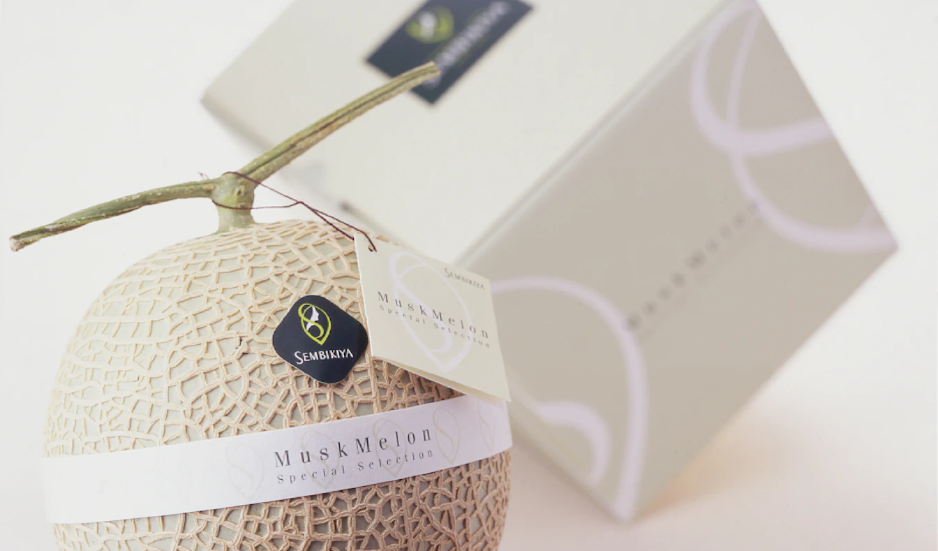
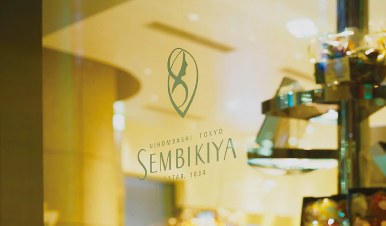
Sembikiya-Sohonten is a fruit shop that has a tradition of over 190 years. Although the company is well-known, especially in the Kanto region, it was looking for a new path for growth as it entered the 21st century. The brand concept was rebranded as "a higher level of prosperity" to appeal to younger customers whose image of luxury had led to a high threshold for the brand. The symbol logo was of "Demeter," the goddess of harvest, to symbolize the rejuvenation of the brand. It was newly developed using a motif that had rarely been used since its introduction in 1971. In 2005, the company opened a new headquarters in Mitsui Tower in Nihonbashi, Tokyo, which embodied the evolution of Sembikiya-Sohonten. Since then, branding has continued to evolve with time.

| Client | SEMBIKIYA FRUIT Co., Ltd. |
|---|---|
| Industry | Food sales / Restaurant management |
| Category | Long-established Corporate Branding |
| Service | Brand Concept/Purpose/Corporate Philosophy / VI(Visual Identity/Logo) / Brand Style / Item Design / Brand Guidelines |