Wellell
Evolving as a "source of health and satisfaction" with a purpose
A rebranding project to celebrate the company's 30th anniversary, introducing and promoting a full-scale branding purpose for the first time in the company's operations in Taiwan
| Client | Wellell Inc. |
|---|---|
| Industry | Medical device manufacturer |
| Category | Corporate Branding |
| Service | Brand Concept/Purpose/Corporate Philosophy / Naming / VI(Visual Identity/Logo) / Brand Style / Brand Guidelines |
| Project | APEX Medical Corporation, a leading Taiwanese medical device manufacturer, was going through a three-stage evolution—from a trading company, to an ODM/OEM company, and finally to an own-brand company—where strategy and positioning were unclear and not everyone was necessarily looking in the same direction. Along with our determination to establish a stronger presence and solid position in the global market as its fourth stage of growth, In April 2019, the company embarked on a rebranding strategy to redefine itself, enhance unity within the group, and elevate its brand power to a global level. |
|---|---|
| Analysis | In order to become a truly global brand, the company needed to create a "Core Identity" to define its corporate identity and improve its ability to communicate and attract customers. Additionally, to become a strong, globally recognized brand, it was necessary to replace the generic name "APEX," which is difficult to trademark in many countries, with something unique. It was also necessary to dispel the image of cost performance as the primary strength and instead enhance brand strength and positioning by improving perceived quality. |
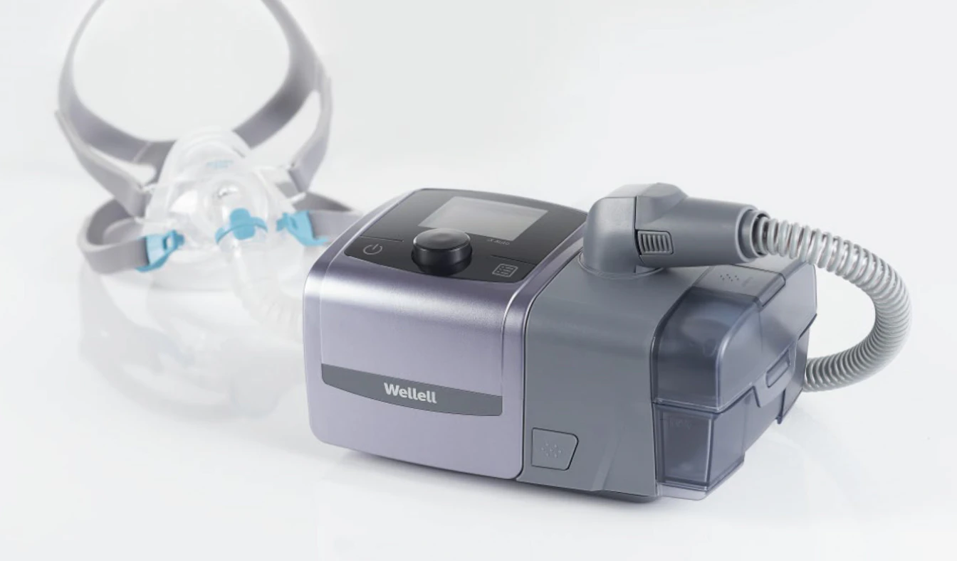
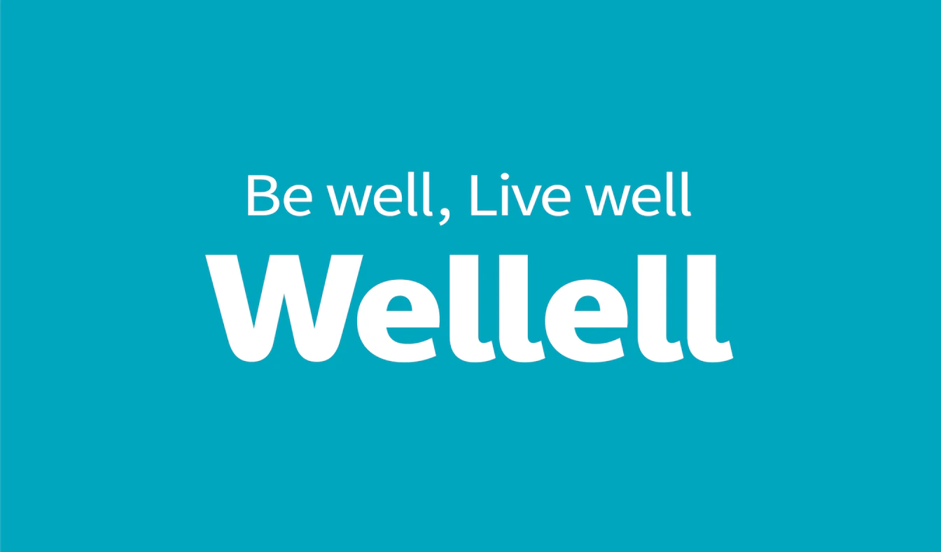
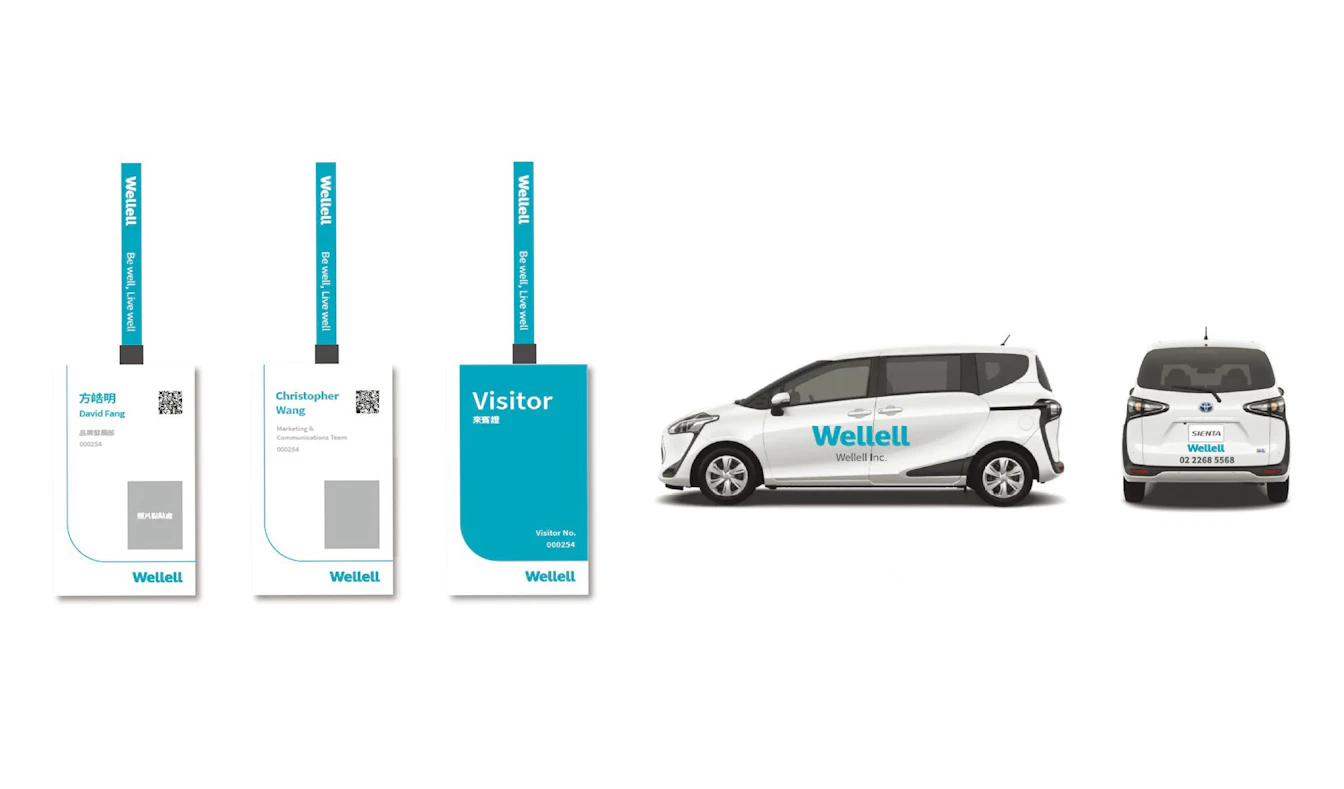
| Solution | We provided comprehensive support, ranging from internal and external research, to the development of a brand concept that included a purpose for the first time in Taiwan, as well as the development of names, including an internal public call for proposals, overall VI system development and deployment to various items, defining brand style, and producing a brand book. We also assisted in the development of the brand slogan "Be well, Live well," designed to complement the company name. (The slogan was developed internally at Wellell, with Gramco providing direction as needed.) The logo was renewed in turquoise blue, which symbolizes freshness, harmony, and elegance, and is an appropriate color to express the brand concept. As a result, the company has created a distinctive brand that differentiates it from its competitors and lays the groundwork for expansion into global markets. In January 2022, the company changed its name to Wellell Inc. and launched a new brand, Wellell. |
Naming
We worked with employees to develop a new company name that embodies the brand concept, and finally decided on "Wellell" as it is unique, short, easy to read and trademark. This brand focuses on the health of users by offering products and services carefully designed with the user in mind, aiming to enhance their overall health and satisfaction. For this reason, the brand name was chosen for its smooth and gentle tone, incorporating elements of words such as "friendly" and "caring."
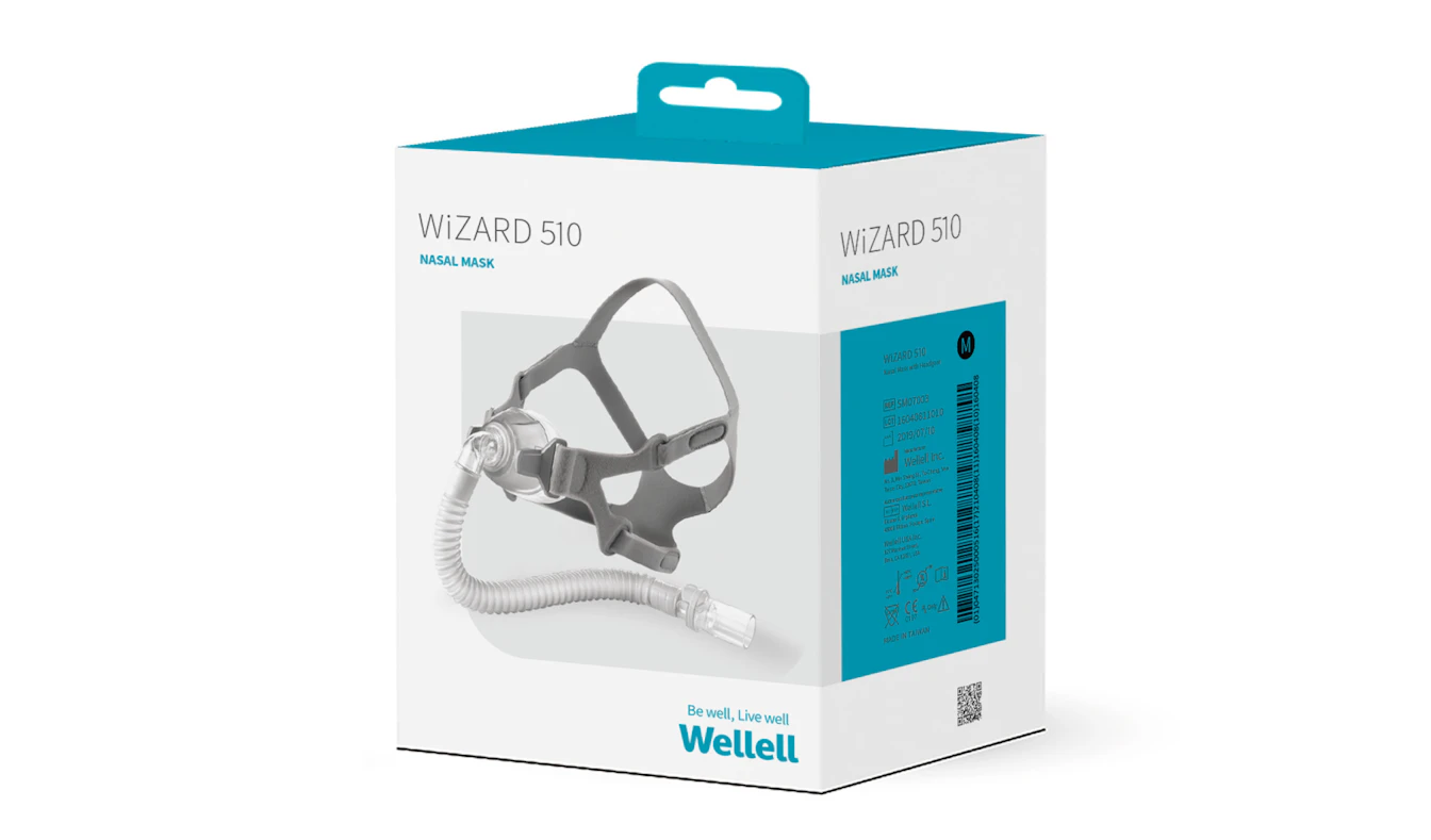
Logo design + slogan
The brand logo was created with the keywords "compassion," "dynamism," and "unwavering dedication." By capitalizing only the first letter and making the rest lowercase (caps and rows), we increased the number of curved parts throughout to create a soft yet impactful impression.

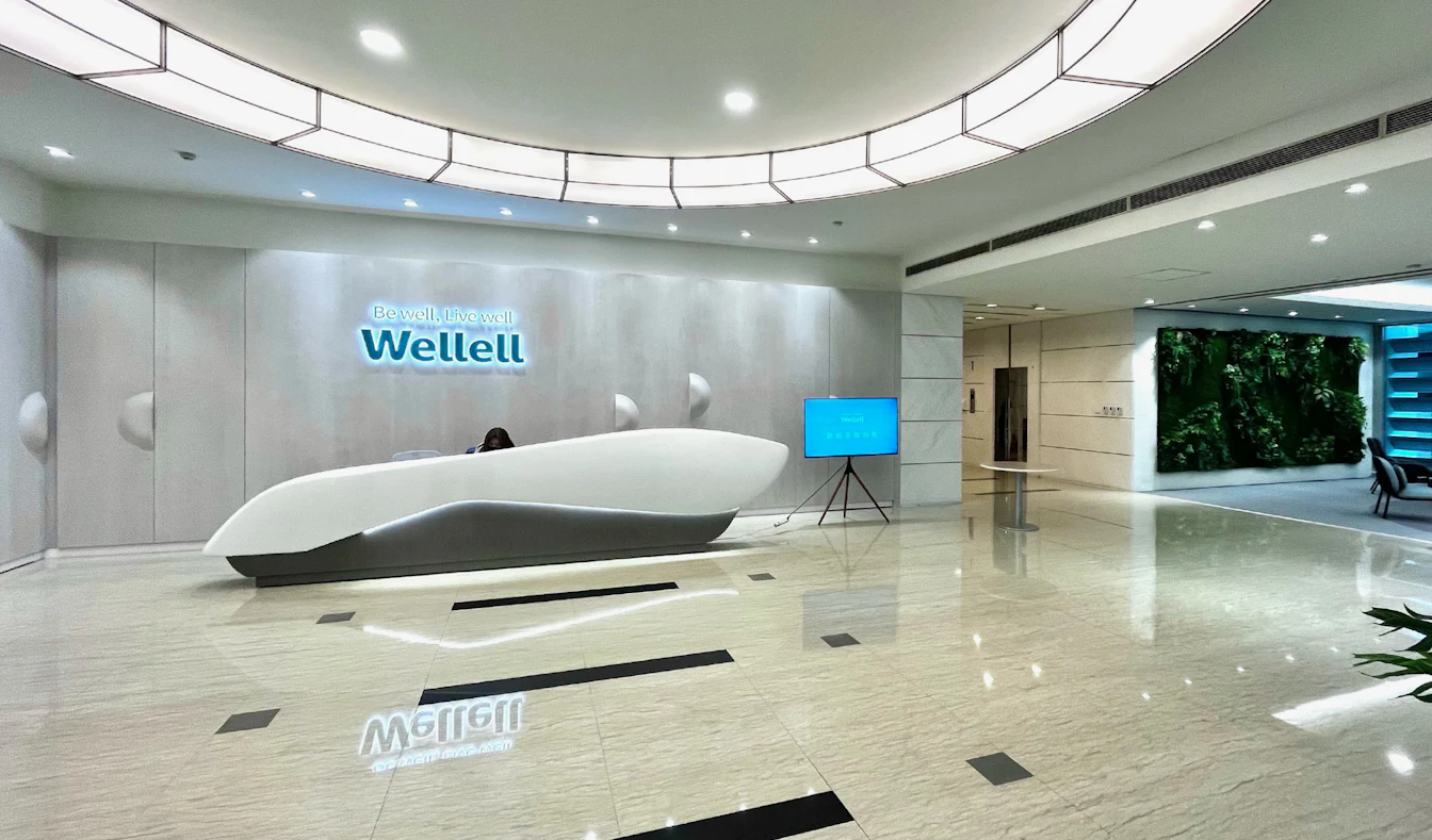
Headquarters, Reception Lobby
The headquarters was also redesigned to align with the brand style, with the entire building becoming a symbol of the Wellell brand.
.jpg)