UACJ
Creating a new identity with global lightness
New company branding project to create a globally recognized identity that incorporates the ideas of the employees from two merged companies
| Client | UACJ Corporation |
|---|---|
| Industry | Comprehensive aluminum manufacturer |
| Category | Corporate Branding |
| Service | Brand Concept/Purpose/Corporate Philosophy / Slogan/Statement / VI(Visual Identity/Logo) / Brand Style / Item Design |
| Project | Furukawa-Sky Aluminum Corp. and Sumitomo Light Metal Co., Ltd. had been Japan's top two rolled aluminum manufacturers, but in order to survive the intensifying competition in a rapidly changing and challenging industry environment, it was essential to significantly improve the cost structure and achieve economies of scale by substantially strengthening the business foundation. As a result, a decision was made to merge the companies to emerge as a "globally competitive major aluminum company" with a strong presence in the global market. A branding project was launched in 2012 to create a new name and logo design for the company. As months passed, the company faced its first crisis since the merger due to a major drop in profits. To overcome this crisis as one, a company-wide branding project was launched as part of structural reforms to create a new organizational culture. |
|---|---|
| Analysis | At the time of the merger, there was an urgent need to develop a world-class company name and logo design as a banner for the new company, one that is ranked third in the world among global players. At the same time, it was essential for the new branding to serve as an identity that reflected the ideas of employees from both merged companies, in order to unite them. After the merger, there was a lack of unity between employees of the two previously independent companies. As a result, it was necessary to formulate a philosophy that all employees collectively embrace, rather than one merely discussed and imposed by management alone. |
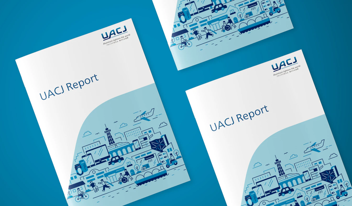
| Solution | We collaborated with ADK International Inc. (now ADK Communications Inc.) and incorporated ideas of the employees from both companies. Furthermore, we welcomed internal suggestions for names for the new company, aiming to create a new banner within a limited timeframe. As a result, the company decided on UACJ. We also designed a brand logo that would serve as a strong yet sophisticated identity for the company as it ventures from Japan into global markets. Then, based on the results of interviews with more than 100 people and the opinions of top management, we formulated the company’s corporate philosophy ("Our purpose"). Additionally, we defined the brand purpose as contributing to a sustainable society for all employees. We then developed a slogan and statement as well as brand style guidelines that summarize the guidelines for consistent expression of the target worldview, and a brand book to be distributed to every employee. |
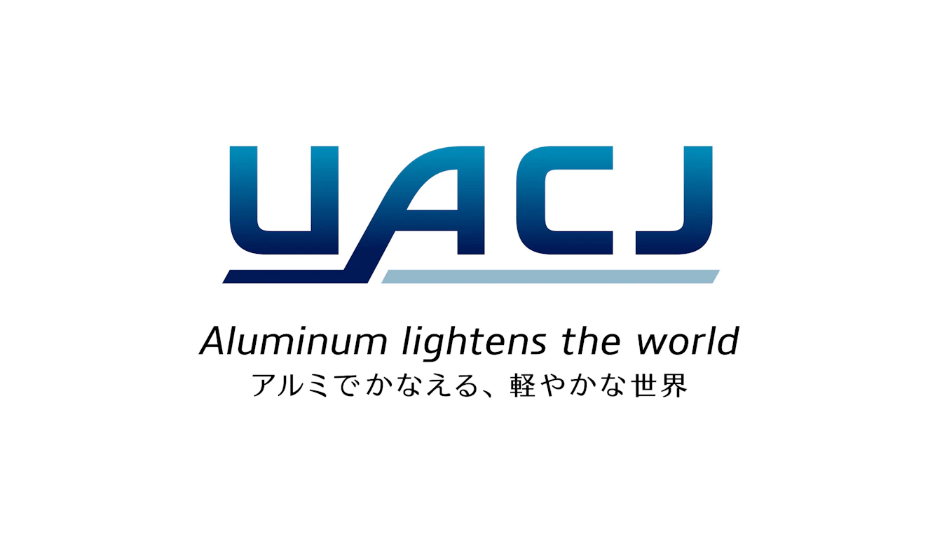
Logo design + slogan
The logo design is based on the color blue, which represents trust and integrity, and reflects the stability of a global company as well as its adaptability to evolving circumstances and requirements, representing the duality of aluminum's strength and lightness.
The slogan is expressed in one word, "lightness," reflecting the characteristic of aluminum's lightweight nature and its potential to reduce the environmental impact of society and create a better world.
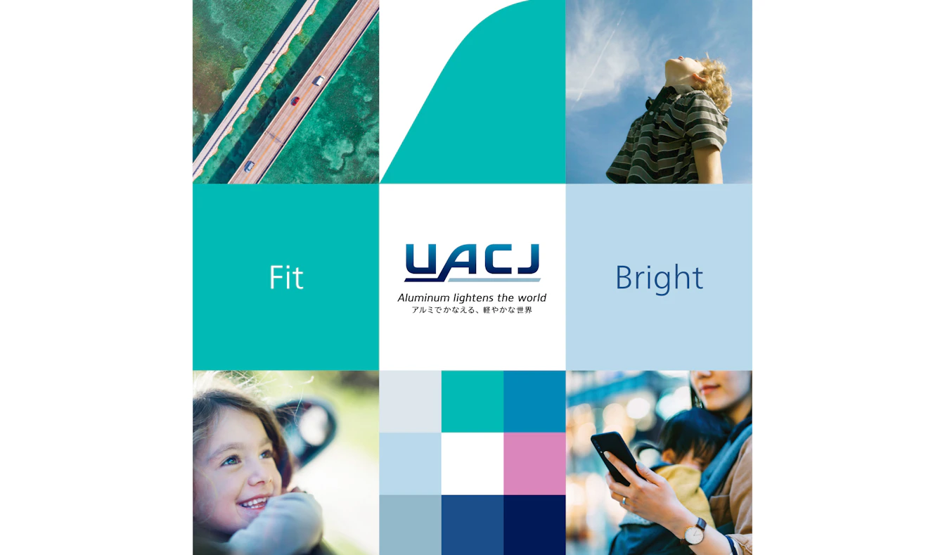
Brand Style
We created a concept board that expresses the UACJ's worldview with brand colors and photographs, using the creative keywords "Fit" to express lightness and flexibility, and "Bright" to express the future, brilliance, and liveliness. The graphic element using the A curve in the brand logo expresses UACJ's commitment to shaping the future with the flexibility that defines aluminum.
.jpg)